The Impact of Air Pollution on Global Health: Understanding the Role of Air Quality Maps
September 21, 2024Air Pollution and Its Global Impact
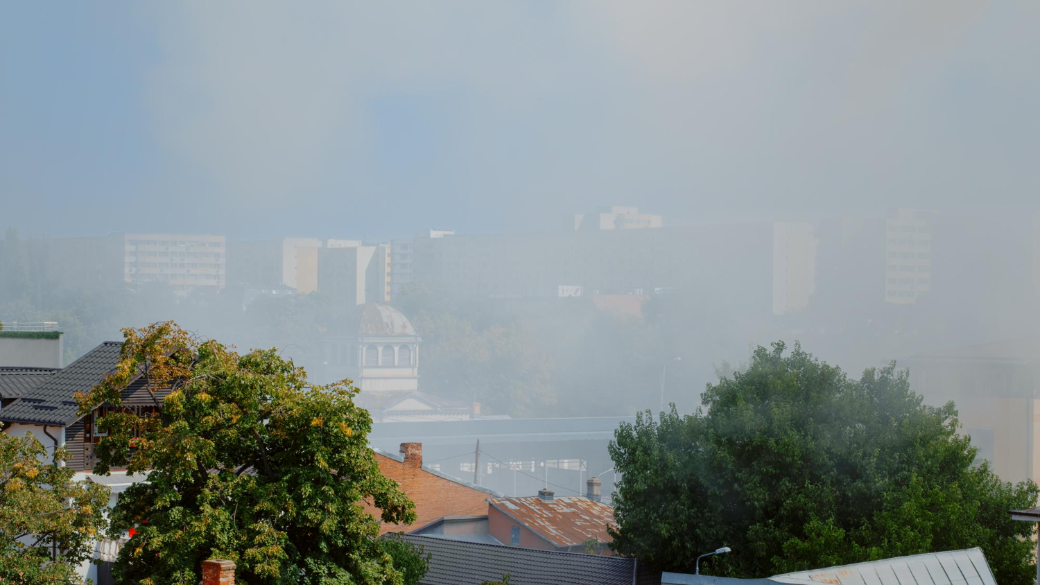
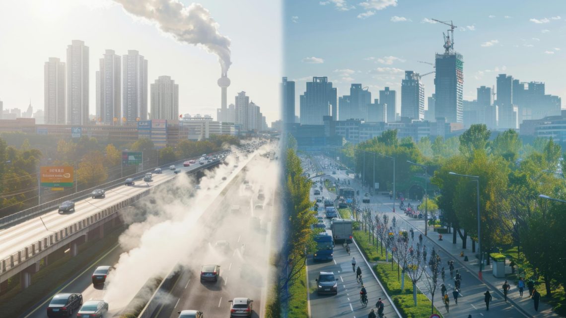
Air pollution is one of the most pressing environmental challenges of our time. The World Health Organization (WHO) estimates that about 7 million people die prematurely every year due to exposure to polluted air. In large cities and industrial regions, the concentration of harmful pollutants like particulate matter (PM2.5 and PM10), nitrogen oxides (NOx), sulfur dioxide (SO2), carbon monoxide (CO), and volatile organic compounds (VOCs) continues to rise. These pollutants are linked to a variety of health problems, ranging from respiratory diseases like asthma and bronchitis to cardiovascular issues, strokes, and cancer.
The scale of the problem is overwhelming. With the rapid pace of industrialization, urbanization, and the increased number of vehicles on the road, many regions worldwide are experiencing poor air quality on a daily basis. This is particularly true in densely populated cities in countries like India, China, and parts of Southeast Asia. However, no part of the world is immune. Even countries with stringent environmental regulations, such as the United States and many in Europe, still struggle with local air pollution problems. Wildfires, industrial emissions, and vehicular pollution all contribute to making air quality a serious public health issue.

Efforts to address the global air quality crisis have been made at both national and international levels. Governments have implemented policies to regulate emissions, encourage the use of renewable energy, and promote electric vehicles. Yet, these efforts are often insufficient. A key challenge is the lack of awareness among the general public regarding air pollution levels in their specific areas. People are not always aware of when the air quality around them becomes dangerous, which could lead to significant health risks.
This is where the concept of air quality maps comes into play. Air quality maps are digital tools that provide real-time data on pollution levels in various locations. They are an essential resource for both governments and individuals, helping to inform decisions and promote public health.
Understanding the Air Quality Map: A Critical Tool for Public Health
An air quality map is a visualization that displays the concentration of pollutants in a specific region, often using color-coded systems to indicate how hazardous the air is at a given time. These maps have become increasingly popular in recent years, especially with the rise of smart devices and mobile applications that allow users to track air quality on-the-go. Air quality maps provide real-time information about pollutant levels in the air, helping individuals and authorities take necessary precautions when pollution levels become dangerous.

Air quality maps rely on data from a variety of sources, including government monitoring stations, satellite data, and private air sensors. These sensors measure various pollutants, such as PM2.5, PM10, carbon monoxide, and ozone, which are the primary culprits in air pollution. Each type of pollutant has its own harmful effects. For instance, PM2.5 particles are small enough to penetrate deep into the lungs and even enter the bloodstream, causing respiratory issues and increasing the risk of heart disease. Ozone, on the other hand, can exacerbate asthma and other lung conditions.
These maps typically use an index called the Air Quality Index (AQI), which categorizes air quality into different levels, ranging from good to hazardous. In the United States, for example, the AQI is divided into six categories:
1. Good (0-50)
2. Moderate (51-100)
3. Unhealthy for sensitive groups (101-150)
4. Unhealthy (151-200)
5. Very unhealthy (201-300)
6. Hazardous (301-500)
Each category is color-coded to provide a clear, visual representation of air quality. Green indicates good air quality, while maroon or dark purple signals extremely hazardous conditions. The beauty of air quality map lies in its accessibility. By providing real-time data in an easy-to-understand format, they empower people to make informed decisions. For example, if the AQI in a particular city spikes due to a wildfire or industrial activity, residents can use air quality maps to know whether it’s safe to go outside, exercise, or keep windows open.
The importance of air quality maps goes beyond individual use. On a larger scale, these tools help policymakers and scientists understand patterns of pollution, identify sources, and develop strategies to mitigate their impact. Public health officials use this information to issue warnings during high pollution days, while urban planners can make more informed decisions regarding the location of industries, transportation networks, and green spaces.
Author Profile
Latest entries
 BusinessDecember 18, 2025Advanced Transformation Through advanced VR learning systems
 ShoppingDecember 17, 2025Ideální dárek pro každou příležitost – dárkový poukaz vivantis
 SportsNovember 18, 2025CRACK Reloaded Pre-Workout – A New Level of Controlled Training Intensity
 BusinessSeptember 25, 2025Highest Security Standards with a banking eKYC platform


